Monday, June 14, 2010

A Reader's Edwardian Townhouse in London!

After my post, Renovating My Beach House, I received the most reader mail in the history of Willow Decor (if you missed it click here). The transformation was striking and the room came alive. Though painting the walls created a dramatic change, the richness of the room and the true success of the transformation was due in part to the Farrow and Ball Paints. I received many emails from readers who felt, as I do, that the F&B paints are amazing and worth the additional cost (about 2x as much as the popular "store brand"). To be clear I have no affiliation with Farrow & Ball, I am just an extremely satisfied customer. The way the finished walls reflect the light , they produce a result that I feel is worth the additional cost. A reader named Naomi in London agreed with me. She wrote that her home was also transformed and enhanced by Farrow and Ball Paints and it was recently feature in Period Living Magazine. Was I interested in seeing some photos? Well of course I said yes!! So let's take a tour of Naomi's Edwardian Townhouse - It really is amazing!!!
Naomi told me that shades of off white feature heavily through out the townhouse. "Playing with tricks of light was key to creating the optical illusion of more space" Above her kitchen cabinets and shelving are painted in Pointing with New White on the ceiling and walls.
"We painted the original built-in dresser and built the kitchen around it, with MDF shelving, which once given the F &B treatment, looks like its original to the House!"
Just beautiful!! Also notice her lovely collection of antique crockery.
In other rooms she used the warmer Farrow and Ball Cream with White Tie (one of her personal favorites). Above is the dining room where she used the F&B paints to transform an old pine oval table bought for only £20! She shows us how rooms and furniture can be transformed beautifully (and inexpensively) with paint!
Peeking out to the amazing gardens!!
Of course the home has outstanding period details like this beautiful fireplace in the living room .
And the lovely ceiling detailing, which is enhanced by the F&B paint.
Here is the before of the entry staircase. She knew I would particularly love this transformation!
And of course I do!! Naomi writes:" The entrance hall had a good wool carpet, which, although neutral, didn't lend any character to the house, and also got pretty beaten up by workmen during the renovations, so I used a piece of antique Hungarian grainsacking (which I know you love) sourced on e-bay. We laid over cutaway pieces of the existing underlay, and found brass stair rods on the Internet for a very cheap price. My Dad helped me lay it and stripped back the stair treads. The banister rail had it's old varnish removed and a stain finish to match the floorboards and stair treads. We painted the balustrades in White Tie, to open up the area, and the walls in F&B Cream, below the rail, and White Tie above it. I love the way the caramel colour of the grainsacking stripes picks out the honeyed colour of the banister rail. I painted and distressed an old Chinese bookcase (very chipped and battered) and a long, wide mirror for the right hand wall, to open up the space again. The glass pendant light on old-fashioned fabric covered cable was from Jim Lawrence."
A peek into her real London conservatory!! You know I adore conservatories and this one is perfect for enjoying a cup of tea!
Her spectacular outdoor gardens. She writes: "I am a huge Farrow and Ball fan and my husband quips if he stands still long enough I will paint him, such is my obsession with painting and distressing old pieces, walls..." I wish Naomi and I lived closer - I am sure we would have a lot of fun together!! To read the original article about her home in Period Living Magazine click here. Thank you for sharing your beautiful home and ideas with us, Naomi!!

Friday, June 4, 2010

Escape to Bermuda


I just got back from a short vacation to Bermuda with my husband. We left the kids to reconnect and celebrate our 18 year anniversary!
Pink sand and turquoise water is a winning combination. As soon as we got to our hotel we immediately relaxed! These two photos are from Tucker's Point. It is a gorgeous hotel.
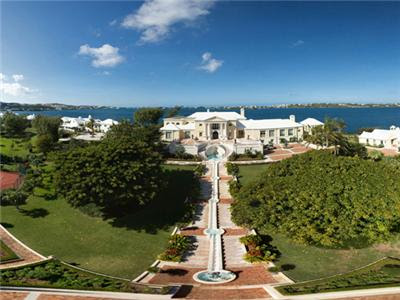
As soon as we settle in, we both always look at the real estate guides; we are always interested in properties. This particular home caught our eye. I guess you could say it's our hobby, because of course we could never afford to buy such an extravagant retreat.
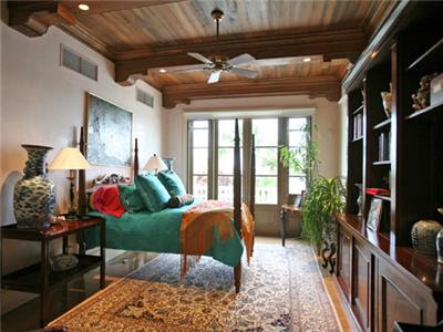
This home was designed and influenced by renaissance architecture. If you look beyond the gorgeous furniture and notice the architecture itself, the room is quite grand. I love the fireplace and the french doors. But what really caught my attention was the ceilings - every room in this estate has interesting ceilings. The wood ceiling above really warms up the opulent space.
Perhaps the most impressive ceiling was in the dining room. The coved ceiling was illuminated in gold leaf.
The kitchen ceiling was also an interesting work of art. I loved the wood design and the way it was white washed and distressed. Of course the zinc hood made me swoon.
I just fell in love with this office! The doors, the view and the ceiling -stained the same color as the ocean. Just beautiful!
I really like the relaxed feeling of this guest room. It is has the classic wood/tropical ambiance. Another room with spectacular ceilings.
Overall the home is a bit too opulent for me but they seemed to get the bedrooms right! Here the view in the master bedroom takes center stage - and the coffered ceiling is nice too.
This is the lovely view off the master bedroom terrace - beautiful iron work on the railings. Again notice the ceiling, clearly no detail was overlooked.
Of course I could get used to cocktails by the pool...but its back to reality for me. If you want to dream a little, check out the rest of this estate here. End of the year school activities with kids are keeping me busy since I returned, but it was a wonderful anniversary trip!!
(all photos Tuckers Point and Sotheby's)

Thursday, May 27, 2010

Renovating My Beach House

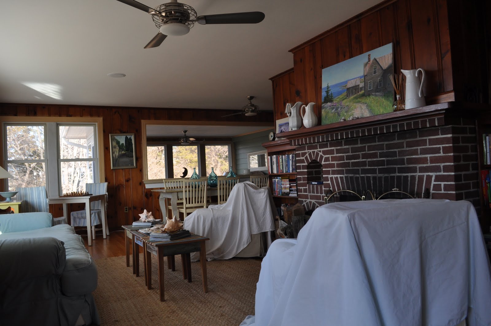
"Renovating My Beach House" really should be titled "How I Finally Convinced My Husband To Let Go of the Stained Wood Walls". You see men love wood walls. For seven years, my husband and many of our male friends would actually cringe when I told them I dreamed of painting it all white. "No, No they would say, this room looks like a mountain lodge; it reminds me of hunting and camping!" And, I would argue "WE ARE AT THE BEACH!"

Over time I renovated every other space in the house. Lady luck finally smiled on me when our heating bills got too high. "We really should replace the single pane glass windows," my husband reasoned. Of course the original windows were odd sizes and to save money we needed to buy stock sizes. New cut outs in the wall meant new trim mouldings. The original walls were an orangey stain which I couldn't even begin to match, and all of sudden we HAD to paint! So really this post should be titled " The Magical Transformation with Paint" because that is what it truly turned out to be.

The photo above is the house as I bought it seven years ago. It is our living room and dining area taken from the original real estate listing.

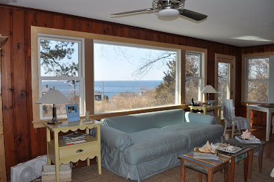
Here is living and dining area before we painted.
A few gallons of primer and some Farrow and Ball Paint in Pointing and even I was amazed at the transformation!
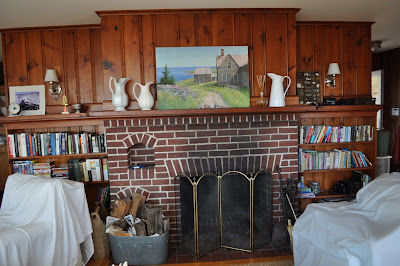
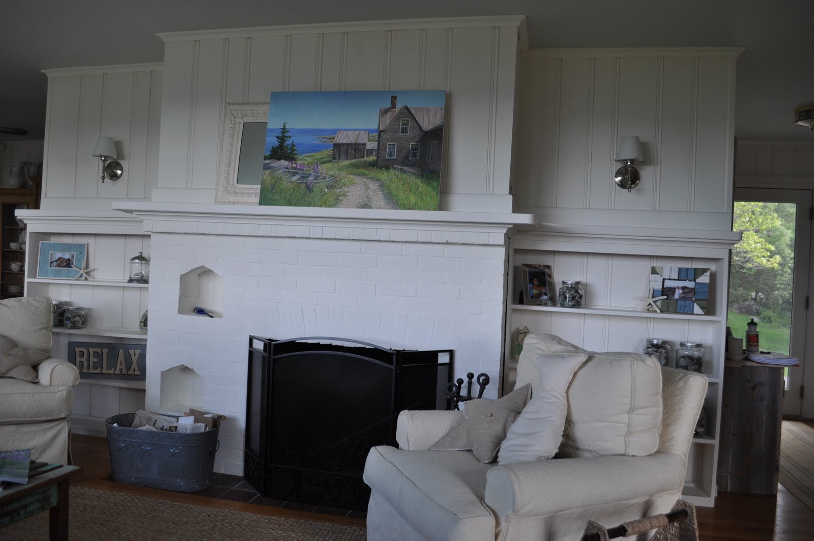
Here is the fireplace. No matter what I tried I could not remove the 40 year old soot stains.
Paint hides everything!
The antique dish cupboard used to just blend into the wall.
And now it is a focal point in the room.
I've been playing around with some shells, dishes and antique pewter and here's what I came up with. I love to change the accessories, but for now I really like this monochromatic look. Oh, and the baskets below hold flip flops - it keeps things more organized in the entry area.
Here is the couch area before - I forgot to put the back cushions on the couch in this photo. Notice the different heights of the window and door mouldings. This used to drive me crazy.
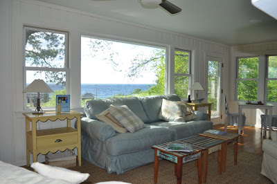
And here is the same space painted. The different moulding heights just fade away - see paint can hide many flaws. Also look closely at the ceiling. You can see a hint of blue. The ceilings are painted in Farrow and Ball's Pale Powder and they look amazing. They are darker than they photograph. The pale blue really picks up the color of the ocean. Isn't the view amazing?

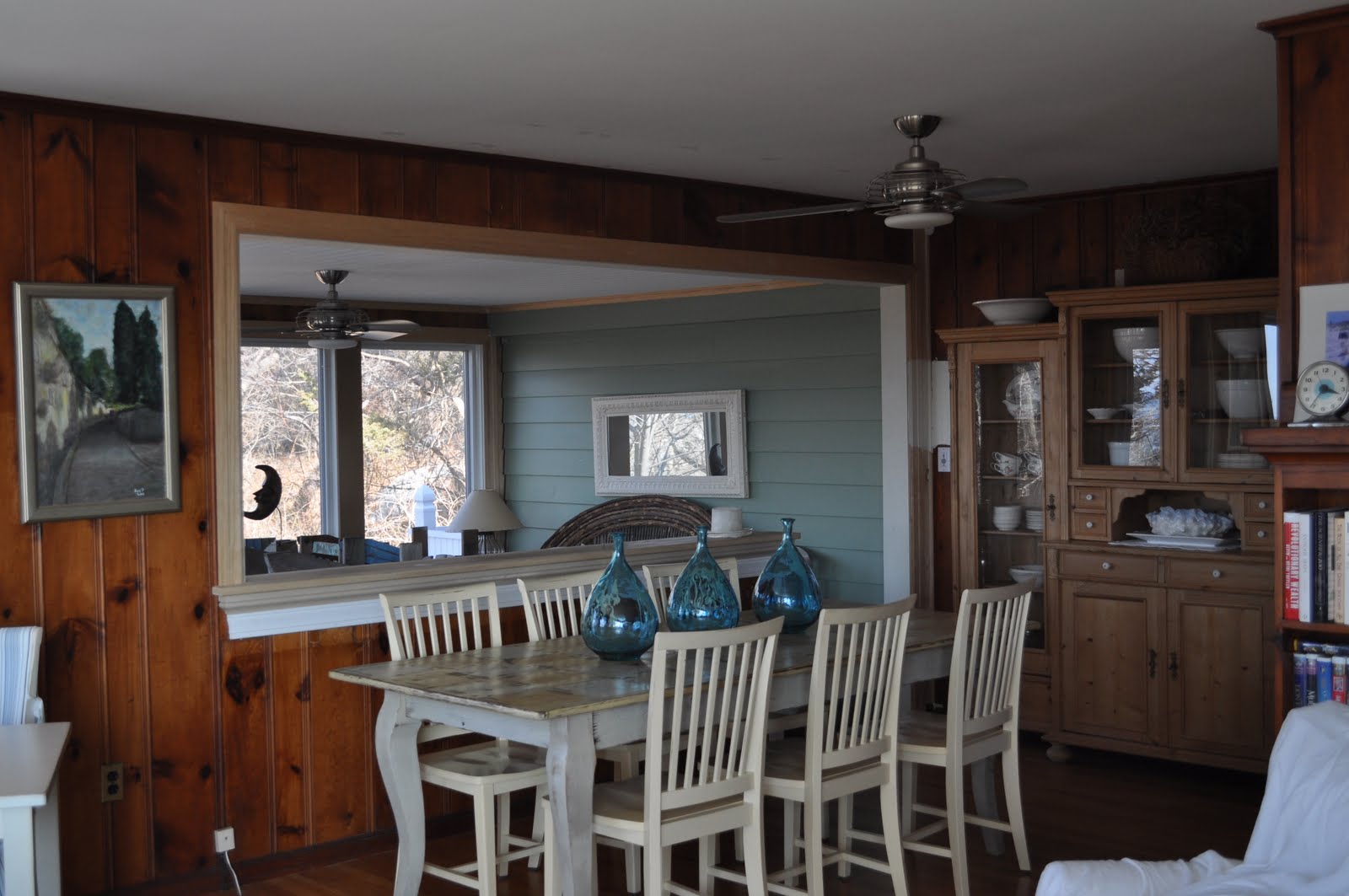
The eating area before. When we originally purchased the house, the half wall was actually a full glass window and a a door. We winterized the porch and opened the area up. It really visually enlarges the space.

The after photo shows how cohesive the space looks with it all painted a uniform color.
Here is a close up of the four season porch before.And the amazing after!
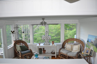
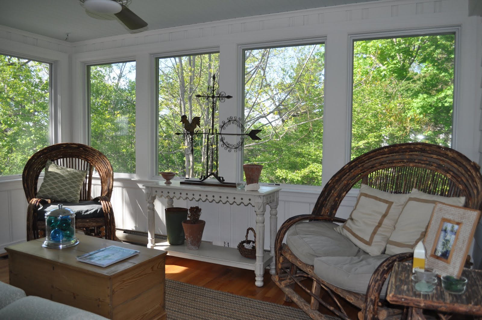
Here are close ups of the Willow Furniture I bought off the back of artisan's truck 10 years ago at a flea market. I have owned the weather vane for 20 years. I bought it at a barn sale in North Carolina. Wisteria is now making an exact reproduction. So now I am not sure that mine is actually old or a 20 year old reproduction, but I love it just the same. You can see I keep moving the accessories around.
We still have a lot unpacking and finishing to do on these rooms. I have some roman shades ordered and a really fabulous fireplace screen on the way. We will get to all that when we move up there for summer in June, but I wanted to share with you the progress to date.
.
We are so thrilled with how it turned out. My husband turned to me and said "I can't believe this is our house!" A little bit of paint can really transform things- I hope this inspires some of you to paint those wood walls. I'll be posting the outdoor transformations once I finish the gardens, so keep reading!
(all photos Willow Decor)

Tuesday, May 25, 2010

Thank You, Romantic Homes Magazine

A huge Thank You! to Romantic Homes Magazine for featuring Willow Decor in their "Site Seeing" section. Grab a copy and see my Breakfast Room, or read more about it here! If you haven't looked at Romantic Homes lately do pick up a copy - I love their fresh and pretty interiors and helpful tips and ideas!! Thanks so much to Romantic Homes!

Thursday, May 20, 2010

A Sea Captain's Home Revamped for Today

When the owners of this Maine home purchased it, the house was in a state of disrepair. But they knew the house, built in by sea captain Ambrose Childe between 1855 and 1862, would be the perfect summer retreat for their bustling family.
They hired one of my favorite architects/designers, Linda Banks, to renovate and restore the home they called "Big Pink". Linda drew inspiration from the homes seafaring past. To honor the history of the house and its location, she chose an earthy palette of blues, greens and taupes and accessorized with Audubon prints and nautical items.
The salon above was filled with historic details like the intricately carved frieze over the door, gothic door panel and original mercury glass door knobs. These details were painstakingly preserved. Notice how much texture the jute rug brings into the room.

Through the salon you can see the dining room above. Linda keeps the old home looking fresh with a mix of armillary style chandelier and heirloom antiques like the lovely chest. The palette is neutral with soft wall color and jute rug. The scientific charts on the wall add to the nautical, sea captain feel.

Period features figure prominently in every room, like the original fireplace. It's presence is enhanced by the beautiful antique mirror hanging above.

The home is filled with nautical reminders of the sea captain who lived here before the family. Notice the ship model, water charts and Audubon print above. Again a neutral palette and jute rugs allow the many small rooms to blend together seamlessly.
The library is a soft pink. Chairs are upholstered in a fabric with a coral motif and sea inspired rug create a pretty oasis for reading and relaxing.
The completely renovated kitchen is wonderful mix of white cabinetry and soft blue/green island. The counters are honed absolute black granite. Large windows over the sink and a glass door from the foyer flood the space with light.
One of the smaller bedrooms is done in a soothing blue and white palette. Notice the wonderful moulding around the floor to ceiling window which Linda does not hide, but highlights with soft sheer curtains.
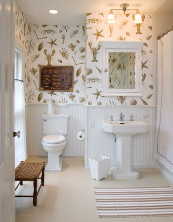
Two new bathrooms were created from one of the bedrooms. White beadboard wainscotting and Clarence House wallpaper in La Mere Beige add to the playfulness of this sea captain's home.
A small bathroom was moved to make room for a landing library with views of the ocean. Notice the book shelves built above the windows to increase storage space.
Special thanks to Linda Banks for a peek into another gorgeous ocean home which captures both the history of it's past with the updated features needed for a family of today.
'
To read more about this home in Maine Home and Digest click here. To see more of Linda Banks' exceptional work read previous posts here and to tour her personal home click here and here. To visit Linda Banks' website click here and finally to visit Linda Banks' store Simply Home click here.
(all photos property of Linda Banks and not to be copied with out permission)