I feel so lucky to be able to meet such wonderful people through Willow Decor. Just the other night I received a sweet email from a fellow blogger, Kristin at
Covetable Designs. She had been overwhelming busy, she said, and tonight she finally had some free time to relax and catch up on reading my previous blog posts. I was so flattered. We started emailing back and forth and it turned into a great treat for me, as I learned so much more about this talented designer! We had so much in common, both having lived in Europe for several years and traveling around; both with a passion for renovation and both self taught designers. I am just in awe of her abilities, so I wanted to share a few images of her home, which she designed, in Dallas.

The above photo is a French dairy turned restaurant that Kristin visited and one of many inspiration photos she used to help design her kitchen. After living several years in London, she was influenced by how her friends lived there.
"They did not view their historic homes as museums, slavish to all the detail of the period. Rather, they used contemporary furniture and accessories to lighten up and streamline their homes. The juxtaposition was thought provoking to an American who was taught to respect period decor, restore old homes, and preserve vintage architectural detail at all costs. And I couldn't really find a designer here who was exactly on my same page. So, I took the lessons of lightening and streamlining to my new home. I wanted architectural detail that was European in feel, without being constrained to any one period or style and I designed the interiors with an eye toward creating a particular mood in each space. The element that ties them all together is the use of neutrals as a backdrop, allowing the colors in fabric and furnishings to glow or in some cases, pop. "
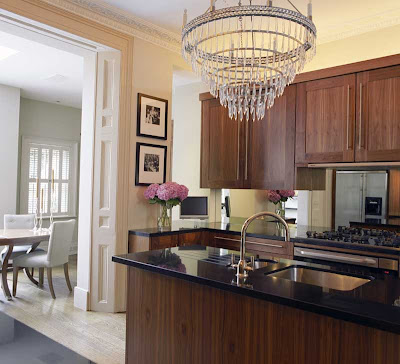
Above is Kristin's new kitchen. Do not be fooled, this is not a renovation of an old home, but a meticulously designed new home with all the elements of an antique. I love the zinc counter and the metal hood, painted to look like aged zinc. Of course I adore the X cross motif which she incorporated in many areas of the design. The Marston Langinger lantern is perfect!
What I find most impressive is the window design over the sink. Kristin boldly painted that area in dark gray and the results are stunning.
A close up of the stove area reveals that she used an antique French fireback as a focal point. The herringbone patterned limestone and the sconces add to the aged French feeling.
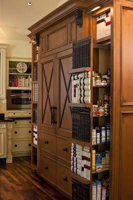
We see the X cross motif translated again on the refrigerator. The pantry pull outs are faced in old books. Very clever.
The breakfast room is a delight! Notice the mix of chairs. Some are upholstered in old German printed grain sacks, while others are slipcovered in striped sacks. Visit her blog to see how she transformed the wooden table and chairs. The zinc elements tie the room in well with the kitchen. Again Kristen takes a bold chance with the red table, a viola, it pays off. The fabulous bookshelf was a exciting find at Mecox Gardens.

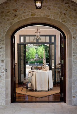
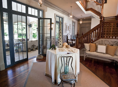
Here is the beautiful entryway.
It is crafted so well its hard to remember this is new construction. Notice the wood banister and wainscoting.
Here is a closer image of the wainscoting. Isn't this wonderful design? The glazing/painting technique really adds a wonderful patina to the space.
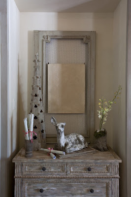

The other wall of the entry has these two wonderful Aidan Gray chests flanking the niches in either side. The wonderful old doors behind the chests were from the bookcase above. Beautiful!!
I have read every one of Kristin's posts and marked several in favorites folder. I am so excited to see more of her work in the coming months. Do check out
Covetable Designs, and when you do, tell Kristin that Gina from Willow Decor sent you!!
~Never miss a post - Subscribe to Willow Decor in the upper right corner~
 One of the wonderful things about having a sister in Denmark is having her share with me some of her favorite shops. She was excited to see this shop featured in Skona Hem and sent it along to me.
  K & CO is a wonderful antique shop in Copenhagen. The owner's home was recently profiled in the magazine. Their home is a wonderful mix of industrial and Gustavian styles. Let's have a peek.
 In the entryway a console table with marble top was given a new coat of Gustavian gray paint. The iron roof decoration is a beautiful focal point and the vintage shelf makes wonderful coat rack.
 The living room is an interesting mix of hard industrial lines and soft linen upholstery. The antique pedestals, lamps and desk, add interest and soften the room. The vintage clock and antique shutters above the couch are charming.
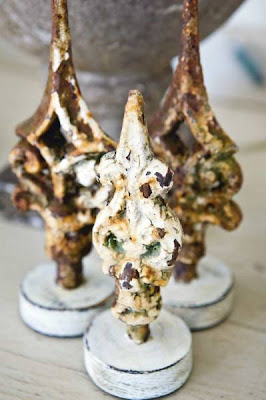 Through out the home the couple adds unique accessories that add whimsy, texture and personality to the space. Above are rusty steeple finials that once sat on a church roof.
 The kitchen is a wonderful mix of stainless steel appliances, Ikea cabinets and hand worn antiques. I love the Danish hanging cupboard filled with traditional blue willow plates. Also the Tolix chairs add a wonderful feeling to this space. The owners enhanced the chandelier with antique crystals.
 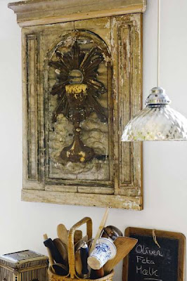 Part of an ancient altar screen hangs on the opposite wall of the kitchen.
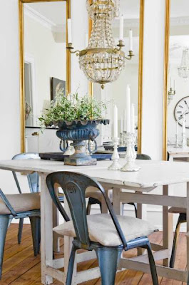 The dining area also has the Tolix chairs. I love the linen pillows as chair cushions. The chandelier gives the space a bit more formality and sparkle; and the mirrors bring your eye up and open up the room. Vintage candlesticks and fluted cast iron urn add a rustic contrast.
 Finally the bedroom is serene in all white. The owners collection of vintage perfume bottles and female bust in Bronze become a uniquely personal vignette.


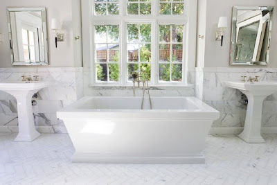 Her choices of mirrors over the sinks and sconces are wonderful. And the window and the natural light really take my breath away.
 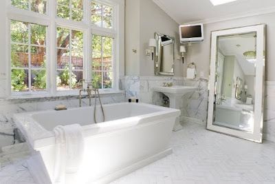 I also like how Celeste added the rather contemporary leaning mirror in the bath. It adds an interesting designer touch.

 Pick up a copy of England's House and Garden or Home and Gardens' Magazines and you are sure to find the work of Interior Designer, Helen Green. She has wonderful streamlined, sophisticated style. Green describes her style as cool contemporary, modern, precise, harmonious and elegant. Above is London Triplex she recently designed for client.
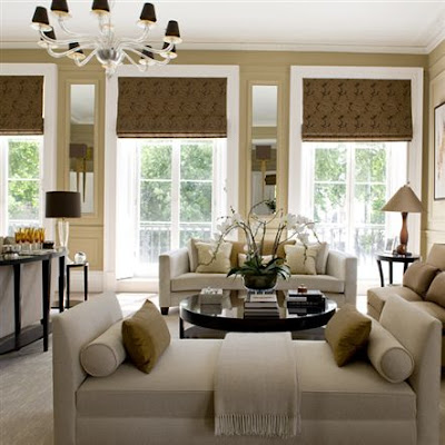 Her palette is often soft neutrals, which we all know I love here at Willow Decor. Green mentioned in a recent interview that in central London, with the homes interesting architecture, she felt color doesn’t really work. "In a sophisticated house where you’ve got a sophisticated palette of greys, for example, splashes of colour like a red cushion doesn’t work for me." Having moved into a historic home with many interesting architectural details I have also found myself moving toward a more neutral palette. Like Green, I felt this was a better way for the room to reveal its exceptional bones.
  This is such a wonderful dining room. I adore the gray blue color scheme. Green keeps the architectural details the focus of this room but enhances them by accenting them with mirrors. Notice the mirrors incorporated into the wall panels above. And, if you look again at the living room photo above you will notice mirrors built in, flanking the windows.
 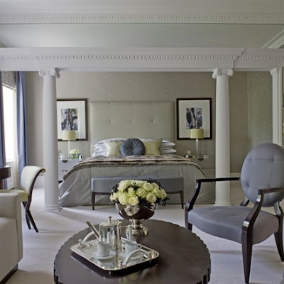 I love this master bedroom. The room's architecture is front and center and beautifully enhanced by a soothing palette of beige. The furniture is a mix of what we call classic contemporary. (The silver hot chocolate pot and the roses add the subtle bling!)
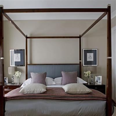 Above is the Guest room -streamlined, sophisticated and very inviting.
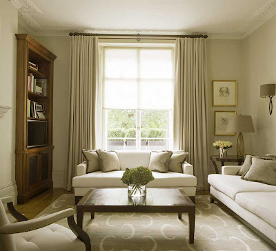

 One of the designer’s favorite rooms is her kitchen, a spacious area that looks out onto the beautiful gardens. Though I personally prefer a white kitchen, I do like Green's cabinets. I think the wood tone is very rich and the crystal chandelier gives the space and unexpected glamour. Notice how similar her dining chairs are to the ones above in her clients dining room.


 Architectural details abound. Notice the way Linda made the doorways higher than traditional doorways and beefed up the depth of the entry and exits. These things bring a weight and added interest into the room.
 I adore this table - It has a more delicate apron than the cabinets but I like how she tried to repeat this feature in the living room. Again her love of antique signs is evident - although the sign above is not an antique and available for sale at her shop,


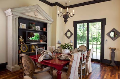
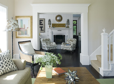 In the family room looking out toward the keeping room. This neutral room is accented in wonderful, fresh green.


